

Línea Flete
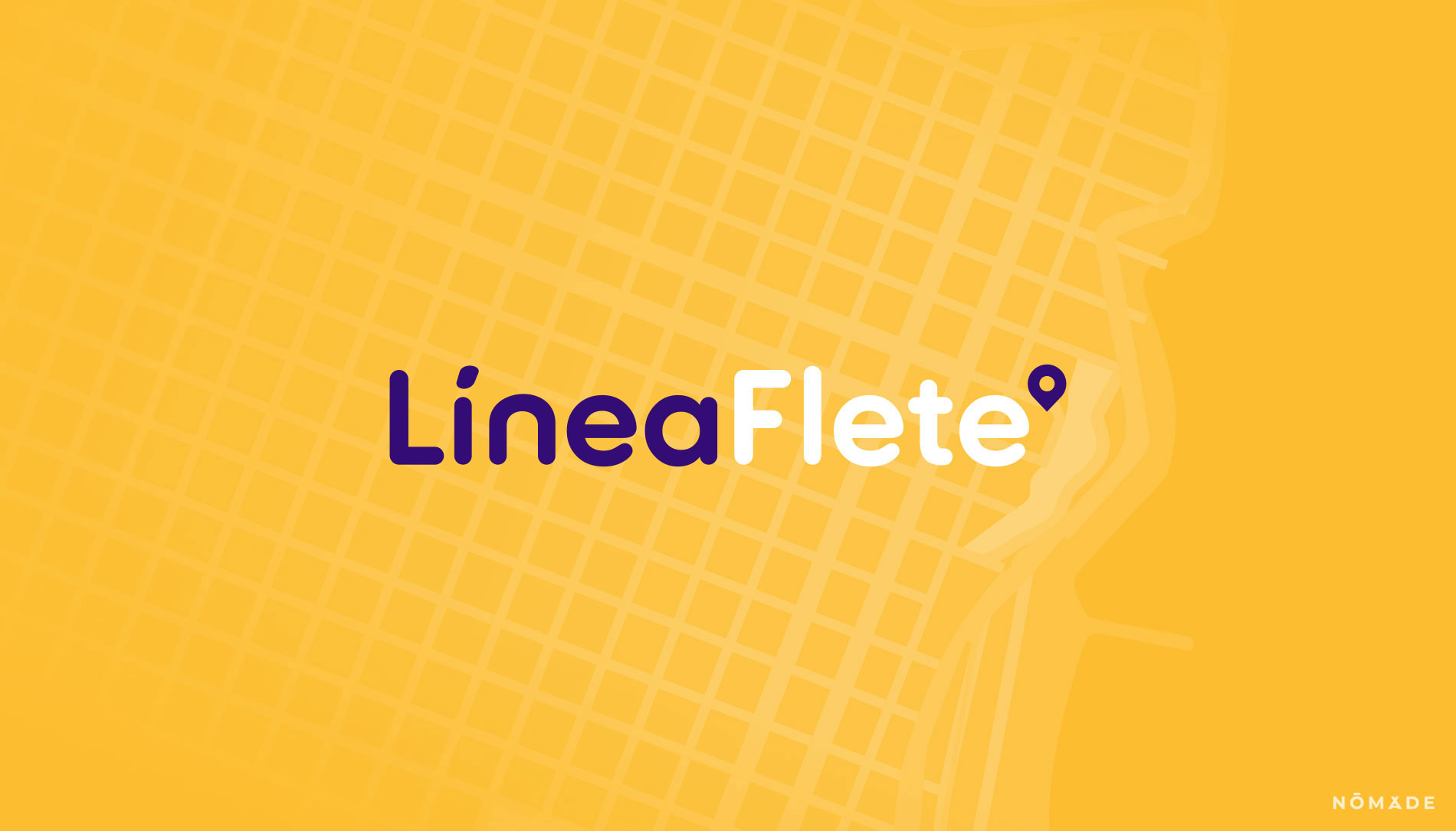
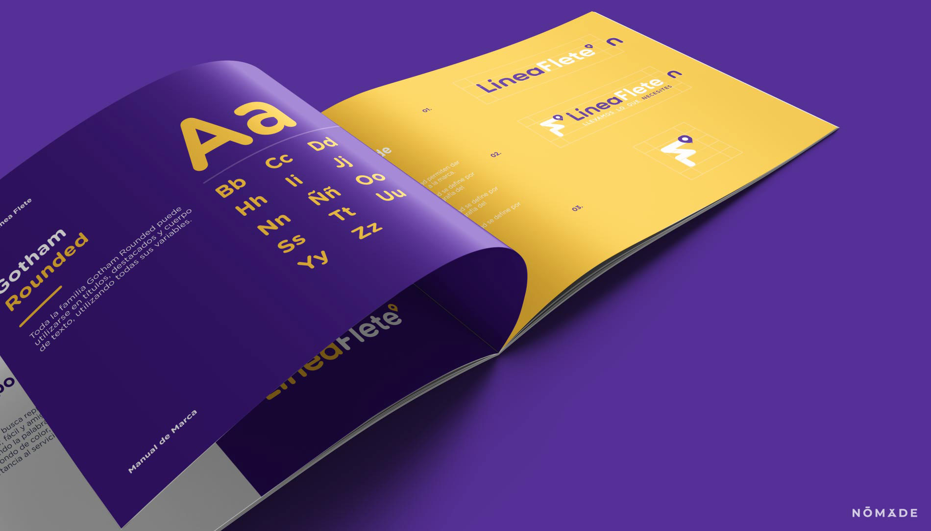
The aim was to use a contemporary and linear typeface, reminiscent of a journey, and the edges were rounded to relate them to the iso.
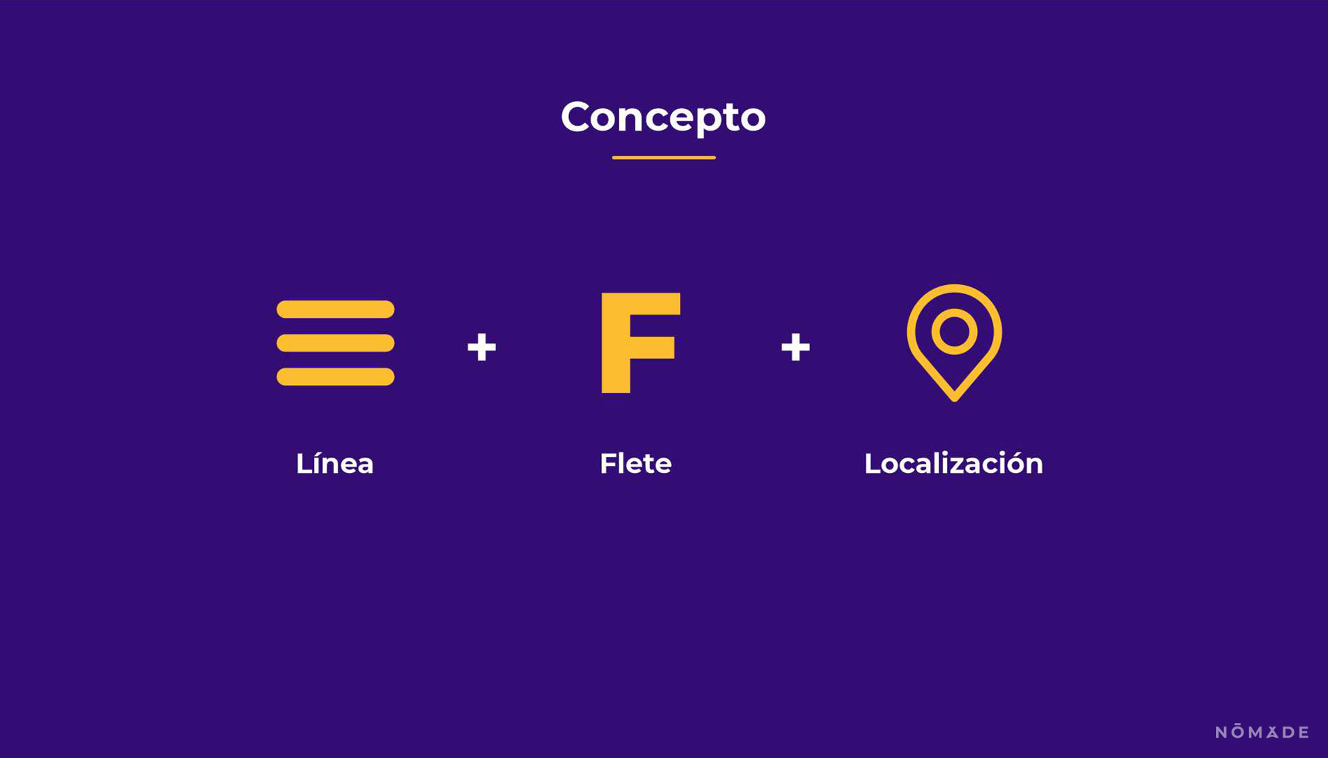
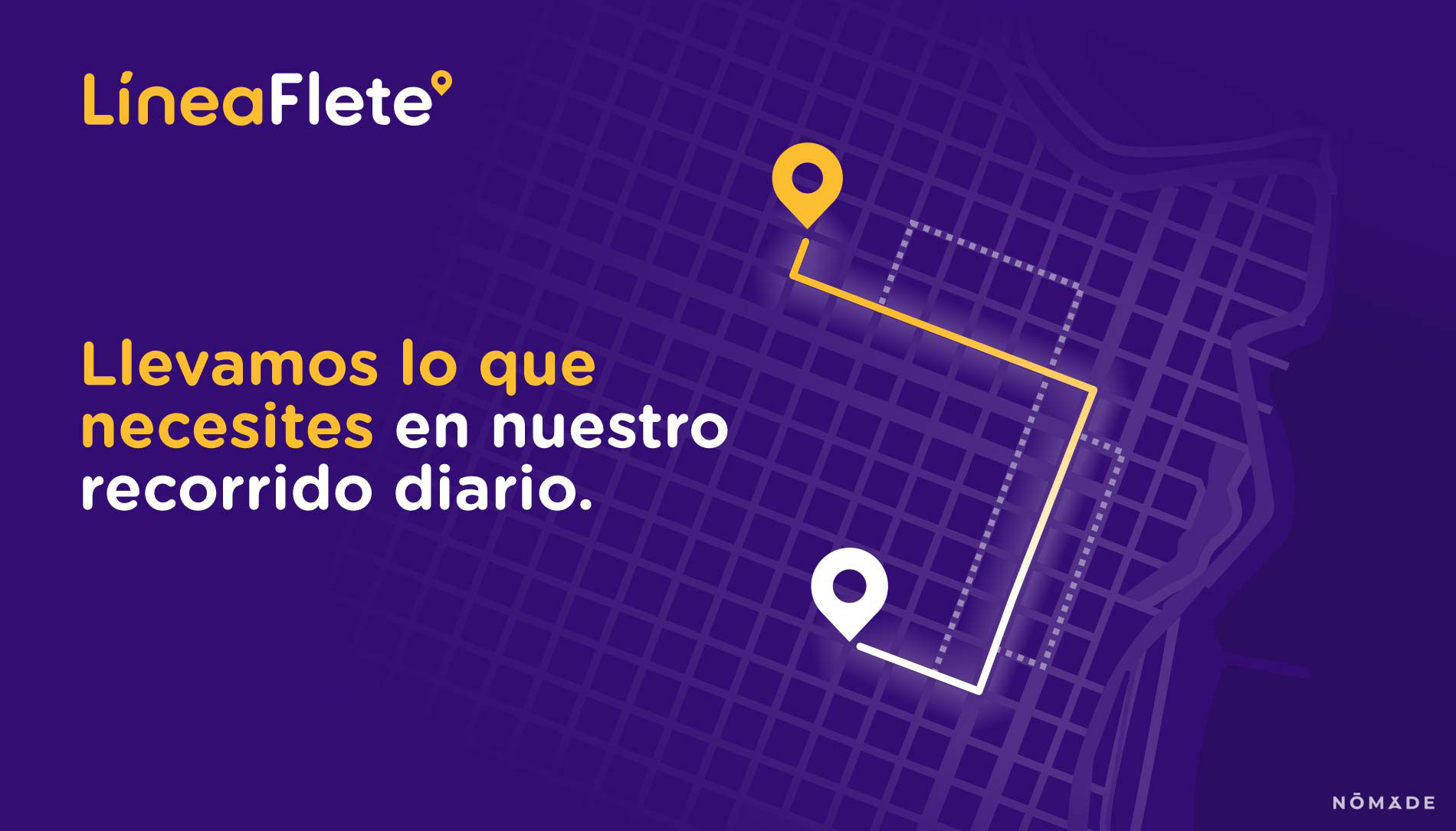
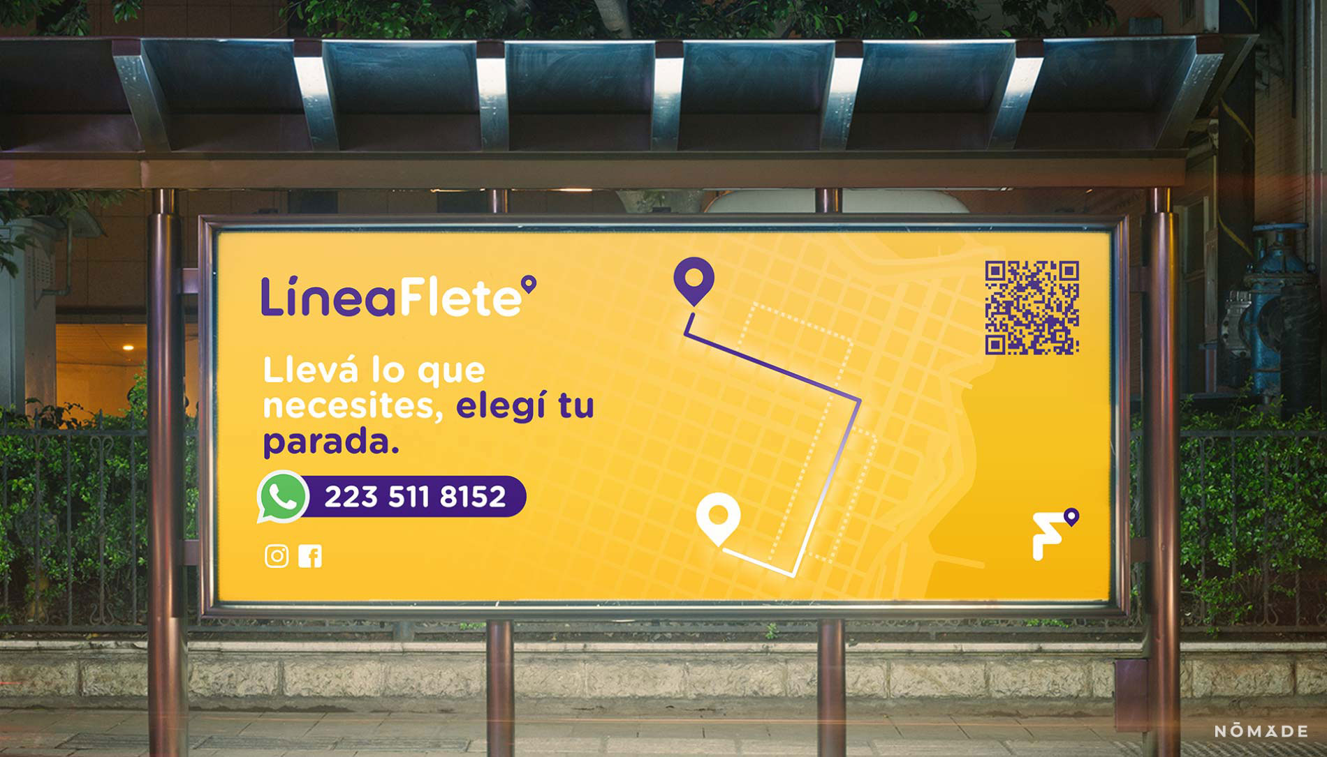
The Isotype represents the route of the freight (flete) arriving at its destination, forming the F of the name.
The placeholder is a direct reference to the concept of transportation, of reaching your destination. The brand appropriates it as an accessory element to the logo.
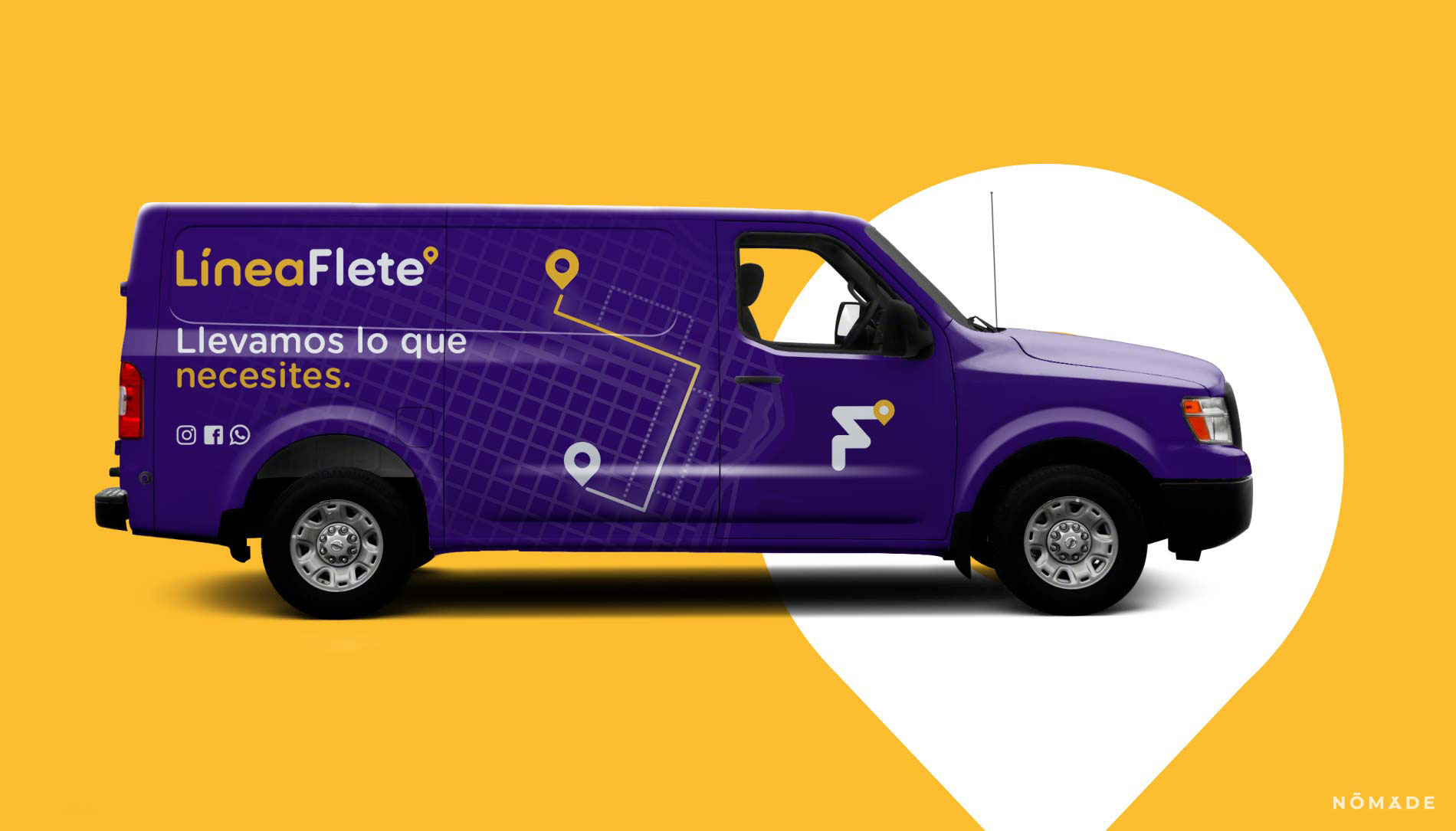
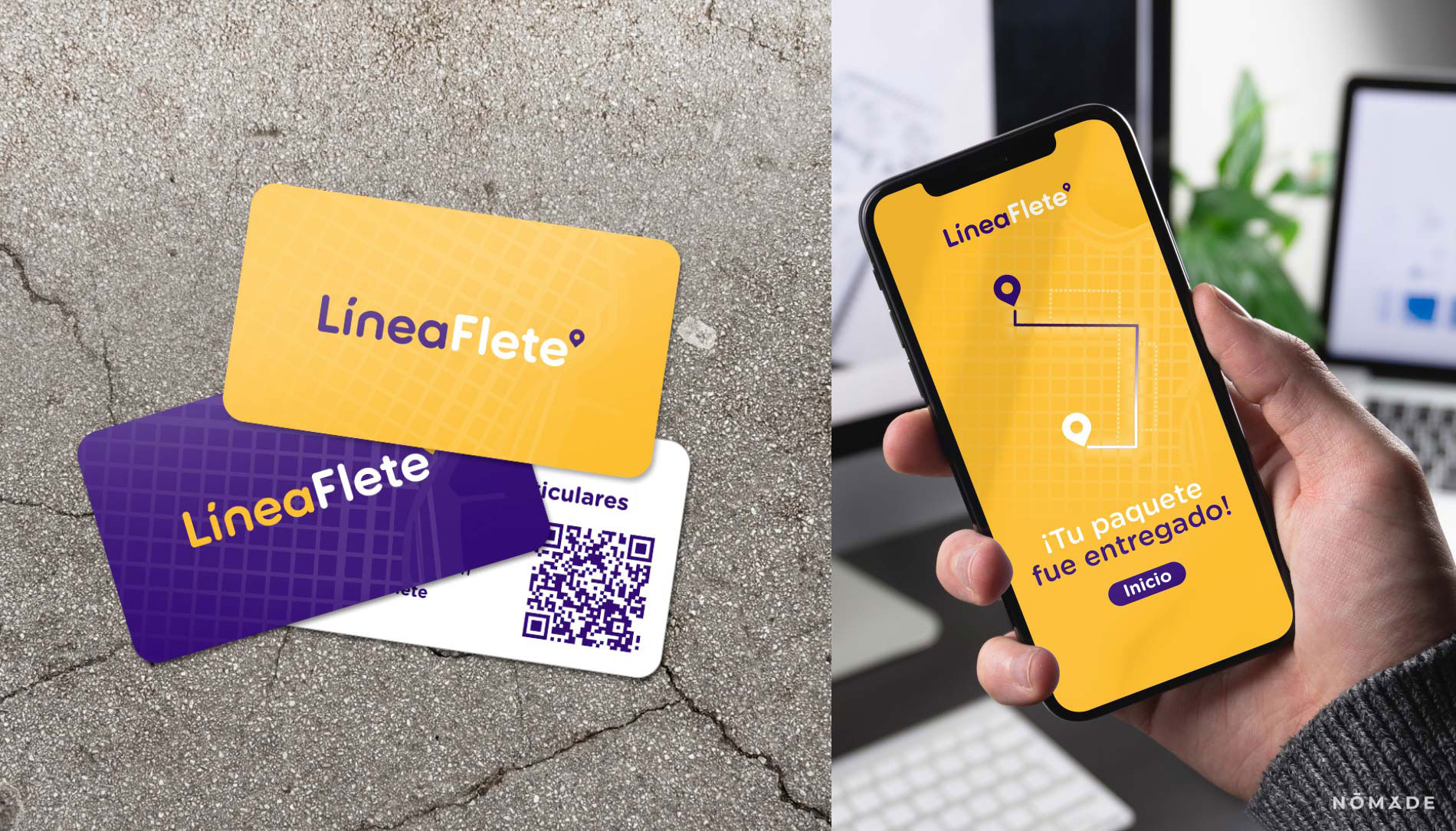
The logo seeks to represent an innovative, easy and friendly service, always highlighting the word Flete (Freight) in white on a coloured background, to give more importance to the service.
- Work done: Institutional Image