A La Pepa
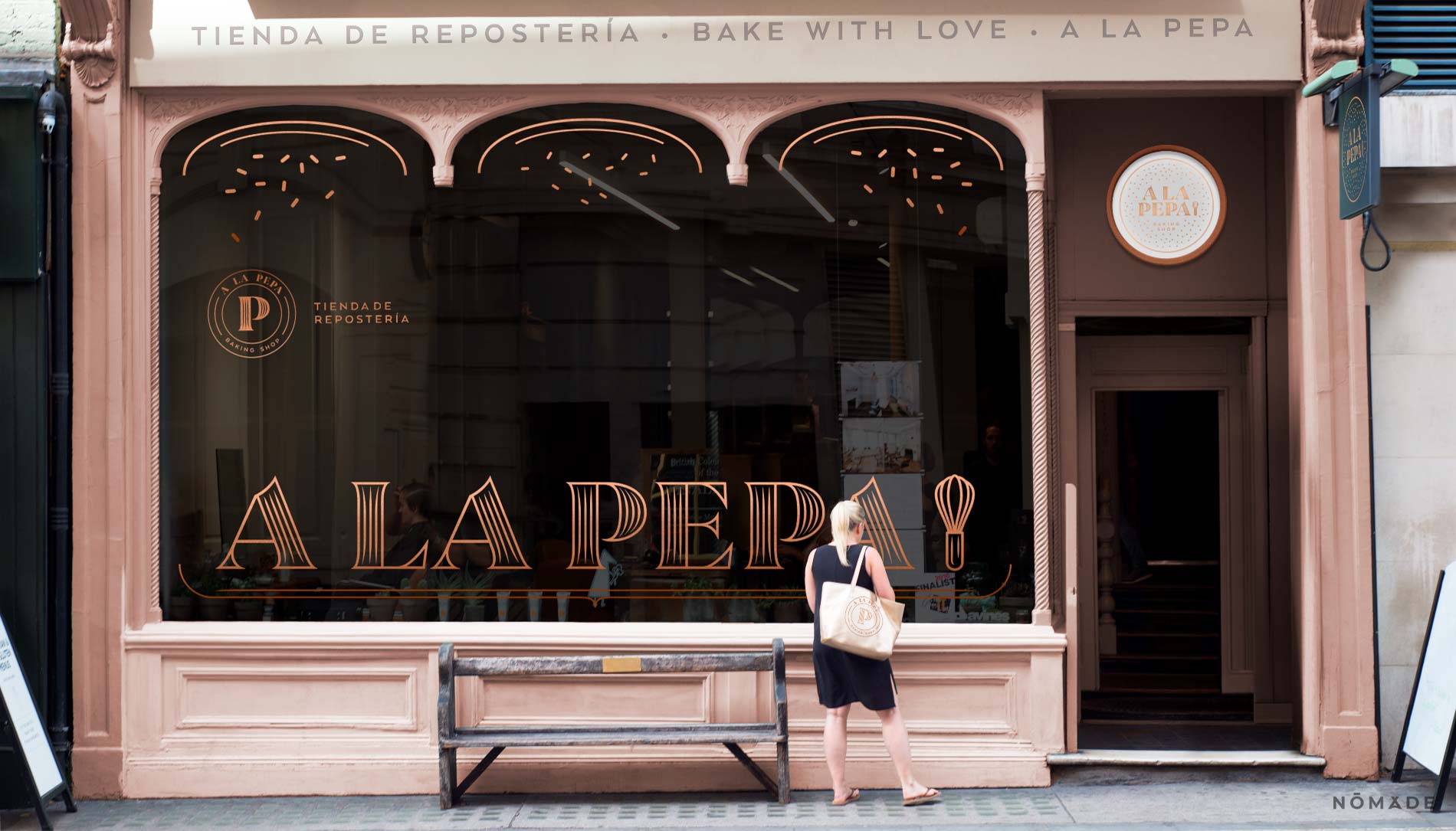
A women's venture named after Pepa, the maternal figure of the family. A la Pepa was born from the concept of a boutique bakery supply shop, where each product is tasteful and of quality.
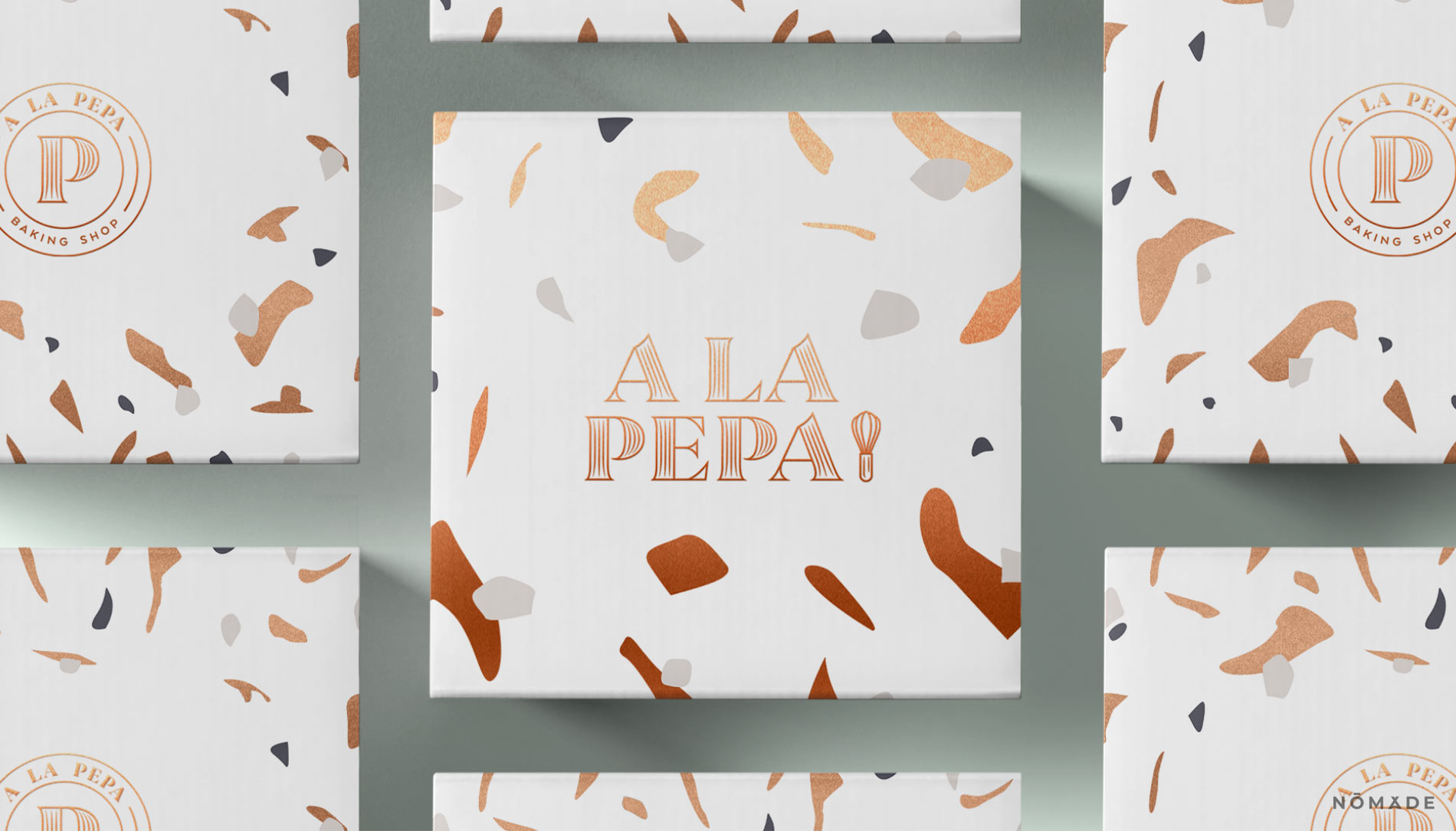
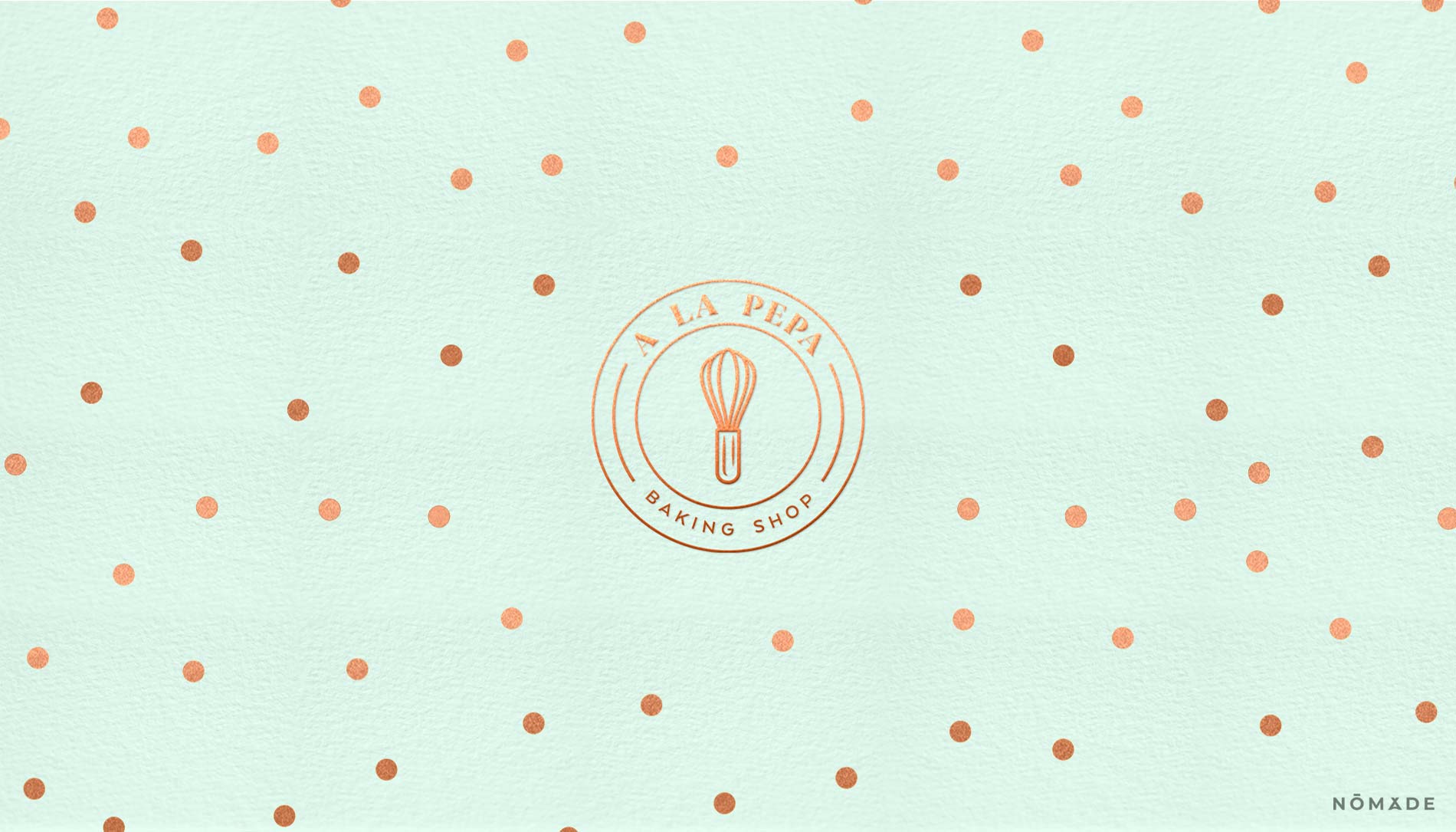
The Brand design was inspired by french patisseries, in order to create an identity based on the classic, but soft and contemporary. Striving to show both the finesse and sweetness of baking in the design, we selected a pastel color palette and a delicate typography.
For the brand mark we worked reimagining a hand blender, an iconic culinary utensil relevant at all times and with a direct link to the act of baking.
- Work done: Institutional Image


